our new(ish) home: the final results
hello all! wow, it’s been a year since i wrote on this blog. sorry about that. new year’s resolution: stop apologizing for being long between posts, because it’s clearly not changing!
those that follow me know that we bought a new place in 2012. it was a much bigger apartment, on the ground floor of a building, with its own entrance from the street. the layout was great. the room sizes were perfect. there were two full baths. the only problem? the apartment was so awful, it would make your eyes bleed. no, really. there are few people beside me who would walk into this space and have a smile on their face, let alone want to buy it.
but buy it we did. we gutted the entire place except for the bathrooms, which got a facelift for the time being. we moved in to our mostly-finished apartment, complete with new floors, walls, fixtures, doors, etc. and then the bottom dropped out on us, almost literally — the steam pipes for the building’s heat run under our apartment, and they burst. all of them. the main pipes and the branch pipes. they damaged our floors, walls, and some of our furniture. we were displaced — with a 4 year old and a 3.5 month old, plus 2 businesses to run — for over a month. and then it wasn’t put back together the right way, so we had to get it fixed again.
but that’s all over now, and after putting the finishing touches on the space, i wanted to finally be able to share with you our new(ish) home, which we are so proud of. for all the pics below, just click to see them full-size. in all their glory.
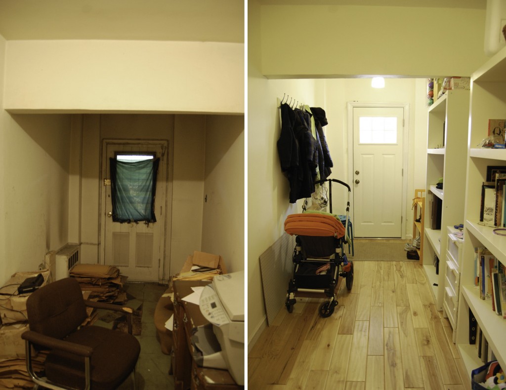
let’s start with the original main attraction to the apartment: the separate entrance. as a couple with 2 kids and 2 businesses to run, having a separate entrance all to ourselves was HUGE. it turns your brooklyn apartment into a house within a building. but, when we bought the apartment, the entrance had not been used in decades. it was filled with junk, the floor was rotted from old damage, it was just a waste. but we knew we could change it into something amazing (with the right contractor, of course).
before on left, after on right. floors: Lumber Liquidators (Virginia Mills Matterhorn Birch); bookcases: Ikea Lack, discontinued.
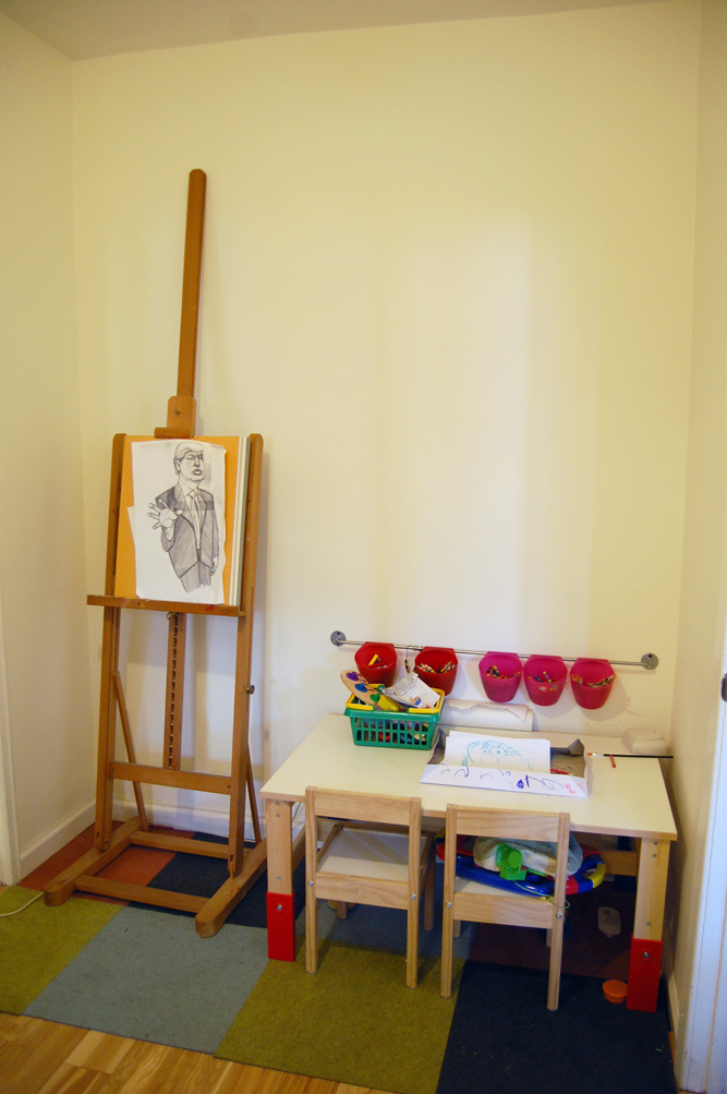
as you can see, there was a big change! we put in a new door, fixed the subfloors and added in our hardwoods — which flow throughout the apartment — and painted the walls a warm white. our old bookcases have gone in here for library purposes, and still there is a ton of room to spare. on the other end of the separate entrance hallway there’s a little nook, and in that space we have put anna jae’s craft table and my easel. now we just need to hang some of anna’s artwork above!
rug: FLOR tiles, discontinued; craft table: Ikea sansad table
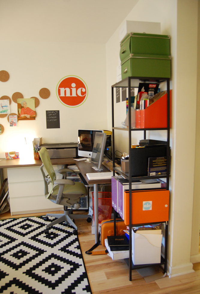
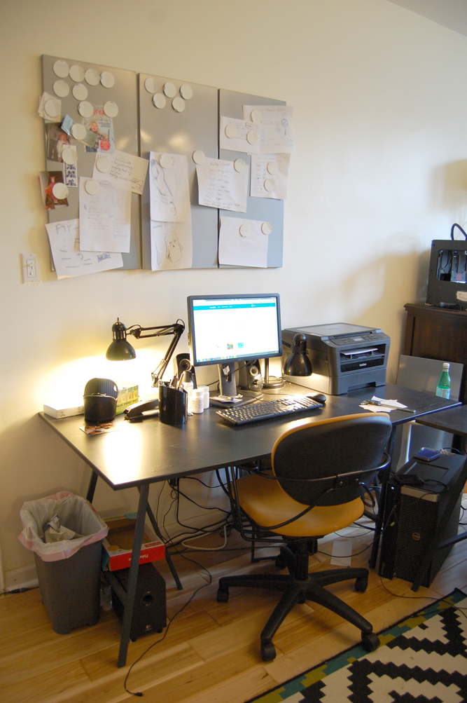
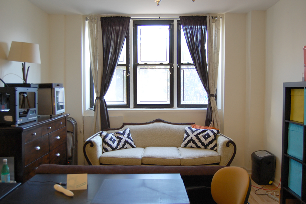
our master bedroom was quite large. we had originally planned to have a great sleeping/lounging/escape sort of space in there. however, dave began to work from home, and had originally set up shop in our bedroom. as a result it was always a mess, and impossible to sleep in for me. i was almost ready to give him my office space, which was an 8×10 room off the living room. but then we came up with a much better idea: setting up a dual office space in the master bedroom. we have both of our desks set up in there, as well as storage, a couch, and a futon. it leaves us plenty of room for meetings, working, assembling, and making our messes. plus, the separate entrance hallway has both doors to the office and the living room, so we can close off the door to the rest of the house and welcome clients or colleagues straight into our workspace, making our home office automatically more professional.
before on left, after on right. desks, left: Ikea Limmon table tops; couch: family heirloom, with Ikea Lappljung Ruta pillows; curtains: Ikea; storage unit with boxes: Ikea Expedit system. chandelier: ours from a Fortunoff sale, 8 years ago.
the nic studio side of the space. rug: Ikea Lappljung Ruta; my desk: Ikea Pragel countertops with Vika Kaj adjustable legs; under-desk card storage: Ikea Malm chests of drawers; my desk chair: Herman Miller Mirra chair.
the studio redeye side of the space.
we plan on reupholstering my grandmother’s couch one day. but in the meantime, i love that it still fits in the space. dressing it up with some bold pillows helps to make it more funky, more us.
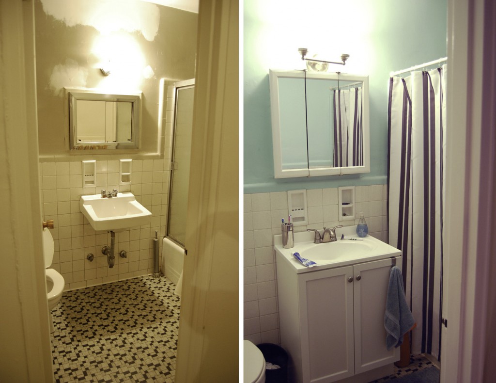
our master bath was less than masterful. but we did not have the money to gut our baths at this time. still, they needed a facelift. taking down the awful shower doors, replacing the old sink with an inexpensive vanity, a fresh coat of paint, and voila: a livable bathroom.
before on the left, after on the right. vanity and medicine cabinet: Home Depot. shower curtain: Ikea, discontinued.
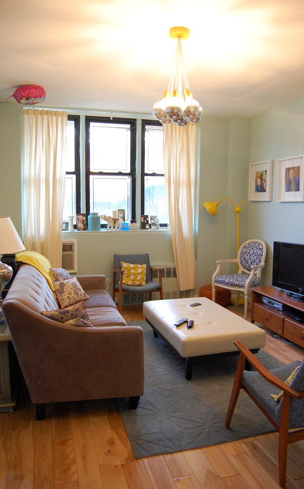
the original living room space had been used as a waiting room for patients (the apartment was used as a doctor’s office). the opening from the dining space had been closed off by a sheet rock wall, and the room was dark and unwelcoming. we took down that wall to let the light through, got rid of the wallpaper and the laminate floors, and added our own personal style. complete with my family portrait wall, artwork from friends and family, and other little details, it’s comfortable and welcoming now.
before on the left, after on the right. buffet: Furnish Green vintage piece; curtains: Ikea, discontinued.
ceiling fixture: Schoolhouse Electric City Chandelier; couch: Macy’s Chloe sofa in Granite; rug: Overstock Dimensions in Loft Blue; ottoman: Safavieh White Leather Ottoman on Overstock; blue armchairs: vintage midcentury modern from a local Brooklyn shop; yellow floor lamp: Urban Outfitters Stella floor lamp, discontinued; white chair with blue fabric: antique Louis chair found on craigslist, reupholstered by Das Upholstery in Ditmas Park.
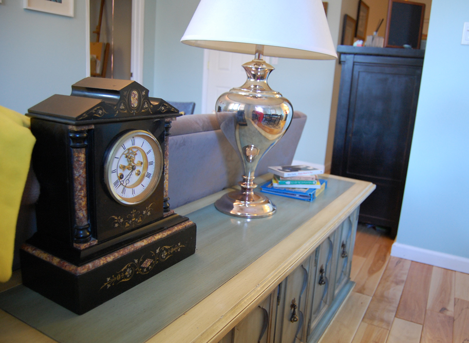
onyx clock: a family heirloom; chrome lamp: Fortunoff’s, discontinued.
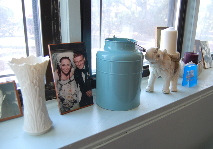
white vase: Lenox Woodland Vase; picture: my parents’ wedding photo, decoupaged onto wood sample; blue vase: Ikea Socker; elephant: family heirloom.
this 1890 antique Louis chair was a steal on craigslist. $90 in original condition, i kept the paint as it was but had the cushions replaced and reupholstered.
black chest: 1930s antique, found at a garage sale for $30 and personally refinished; blue and white print: Banquet Atelier & Workshop; Picasso print: original lithograph.
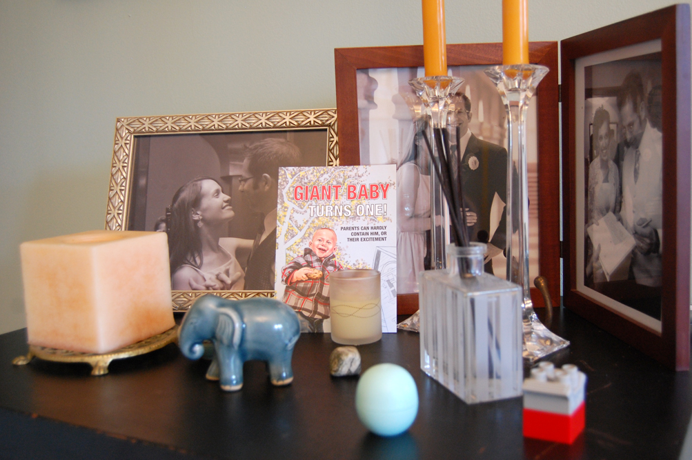
my little collection of treasures sits atop my favorite black chest.
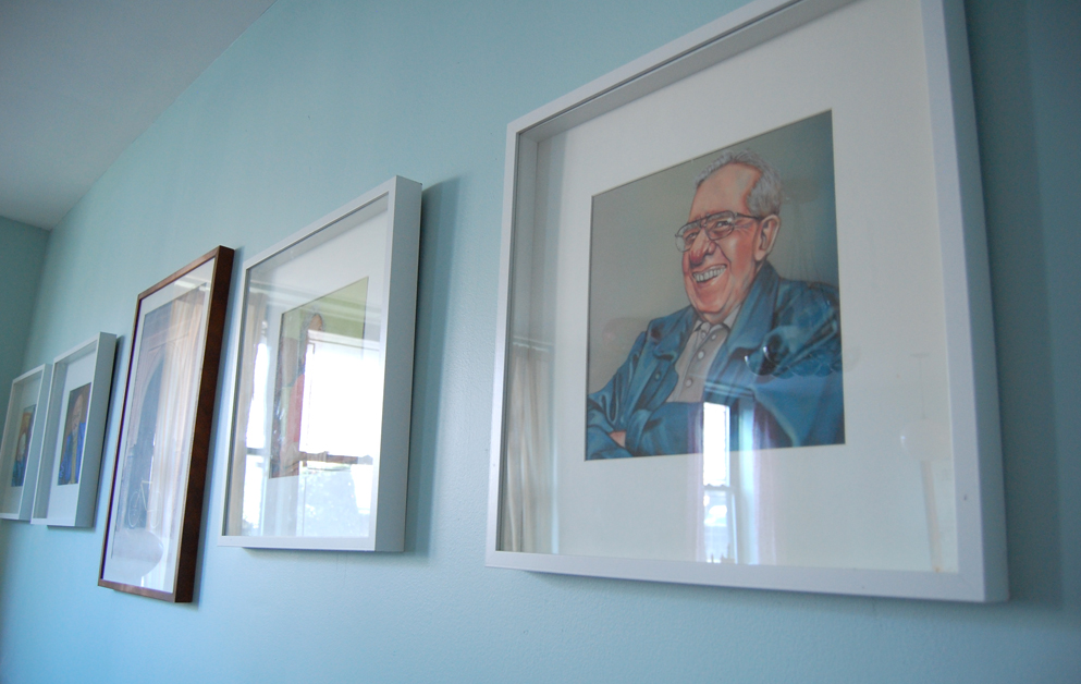
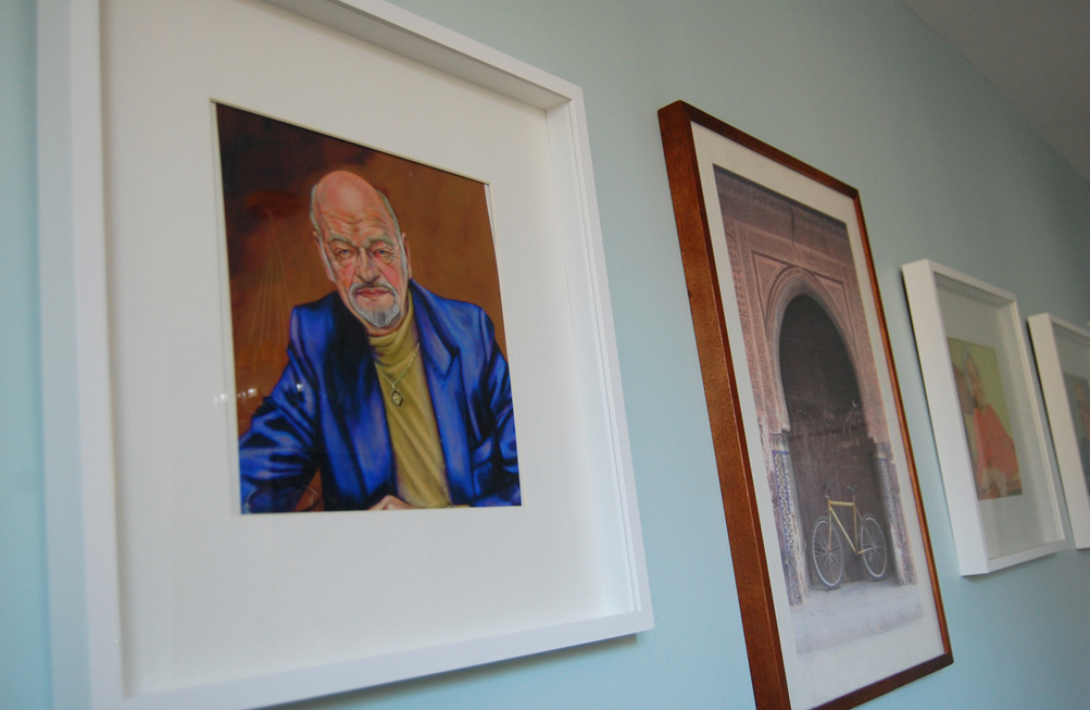
my family portrait wall is where i keep the portraits i’ve painted of important family members that are no longer with us. on the far right, you can see the portrait of my grandfather.
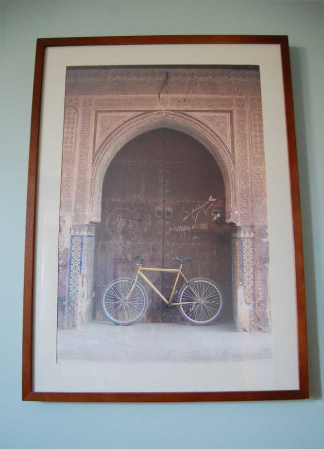
in the center of the portrait wall is this photo, which i took on our honeymoon in morocco. the fact that “love” is scraped into the door has always made me smile. it’s a good reminder as to why i painted the portraits in the first place.
the portrait of my father is in the foreground. i miss that guy.
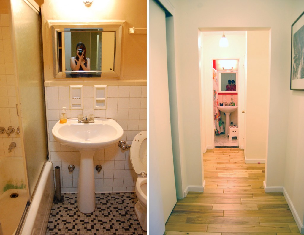
our lobby entrance — the part of the apartment that opens into the lobby of the building — is part of a hallway that runs along the kitchen, the kids’ bedroom, and the other full bath. we also have 2 full closets there and one linen closet. if you didn’t already know, closet space in brooklyn is a major luxury. the hallway ends at the bath, that was just as sad as our master en suite. since this is primarily the kids’ bathroom, and we will eventually gut it anyway, i left the facelift choices up to anna jae, who was 4 at the time. she chose the shower curtain first, and then chose a bright coral red for the walls. it’s a little intense, but it’s also a nice bright spot at the end of the white hallway. we didn’t change the floor tile, but rather covered it with stick-on vinyl tiles to help make the space feel a little crisper. the shower doors were removed, and the tub reglazed. besides the medicine cabinet, everything else remained the same, but it feels so much nicer in there now.
before on left, after on right. medicine cabinet: Home Depot; shower curtain: Ikea, discontinued; step stool: Ikea Bolmen.
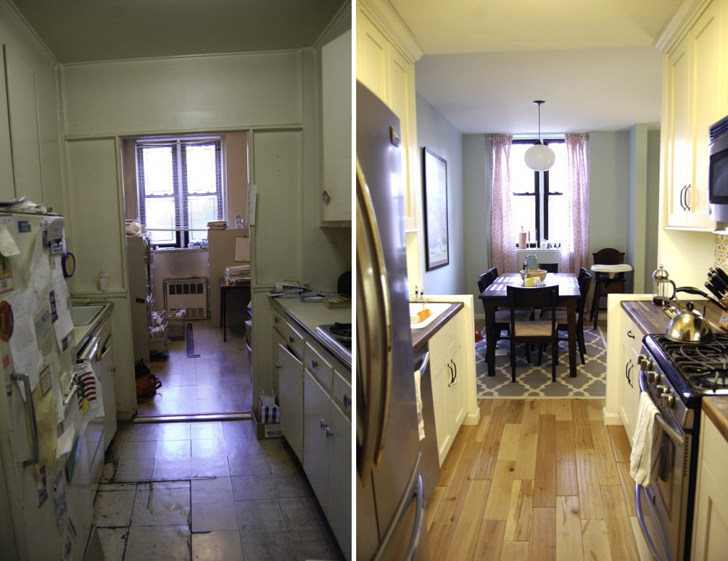
finally for today, one of the biggest changes in the apartment: the kitchen and dining room. this was one of the saddest parts of the apartment. they were clearly neglected, dirty, and dark. there was that awful wall up, containing the dining room away from the living room — and if i didn’t realize immediately that it wasn’t part of the original [plaster] structure, i would have probably walked away. there was also a strange framing at the end of the kitchen that blocked any natural light coming through from the living room which clearly had to be removed. once the wall and that framing came down, it was a different space. and when the new kitchen went in, well… it was even better.
before on left, after on right. kitchen cabinets: Enterprise Wood Products; butcher block countertops: Lumber Liquidators walnut butcher block; area rug: West Elm, discontinued; dining room pendant: Niche Modern Terra pendant.
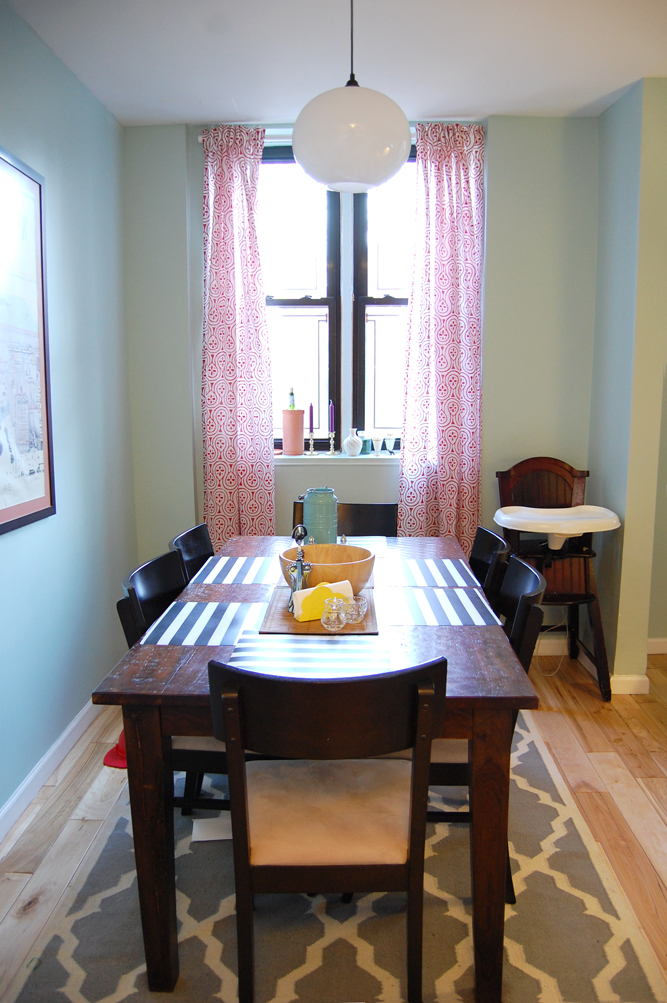
our dining room is a great space, perfect for our table and chairs (which we already had from our old apartment). we decided to keep it simple and uncrowded by only allowing the table in the space. we got very lucky with our light fixture though — I WON IT! i had never won anything before in my life, but i entered into a niche modern end-of-summer giveaway, and i won! the best part? i got to pick the fixture that i wanted. since i knew we still needed something for above our dining table, i chose accordingly. this fixture is 100 watts, bright enough to light the room without being overly bright, and it came in that lovely milky white hand-blown glass. thanks again, niche modern!!
dining table: ABC Carpet & Home, bought in 2006; chairs: purchased from a local store in 2006; striped placemats: Ikea Ljuda; curtains: Ikea Lappljung; pendant light: Niche Modern Terra pendant; large print: View Of The World From 9th Ave by Saul Steinberg.
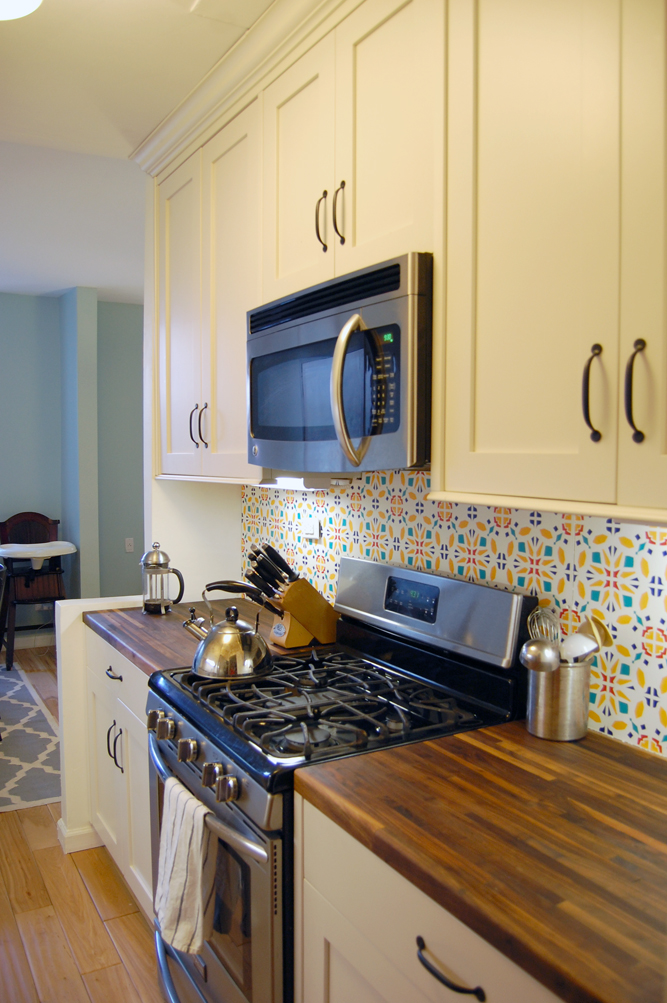
the kitchen itself was just finished. oh, the cabinets and appliances went in before we moved. however, we still had some wiring for undermount lighting to finish off, and then there was the backsplash. oh, the backsplash. i have big plans for it, with mexican painted tile all picked out. but i’m going to do the tiling myself, and frankly, i just didn’t have the time to do it until possibly this summer. but i had been staring at sheetrock and plaster walls for a year, and i was so sick of it. it was ugly, and joyless, and frankly it felt like our place wasn’t done. so i wracked my brain trying to come up with inexpensive options for the backsplash that would be easily completed as a DIY project, and which also wouldn’t impede our efforts for the tiling later. and at 2am it came to me — vinyl! i could make a vinyl “tile” pattern, and have it made into a backsplash decoration. and i am so very happy with the results. i will be doing another blog post on this project, and a step-by-step how-to, later this week. but in the meantime, you can get a look at how it turned out, as well as the rest of our kitchen reno.
before on left, after on right.
i just love the feel of the kitchen. the white shaker cabinets are classic, as are the gorgeous walnut butcher block countertops. but the backsplash does for the kitchen exactly what i hope the future tile backsplash will — it gives it life and energy. it’s a welcome departure from the usual white kitchen. and since the galley kitchen is fairly small, the bright punch of color is never overwhelming.
so, that’s my home tour, for now. i would like to show off the kids’ room, as well as our new cozy “master” bedroom, but they both have a few things that need to be finished before those photos are taken. in the meantime, enjoy everything above. if you have any questions about our choices or process, feel free to ask. the same goes if you are looking for a good contractor in the area — ours is the best around. i love reno and i had a great time doing it. i’d be happy to share.
Leave a Reply
You must be logged in to post a comment.

