
the story behind the rebranding of Tyles
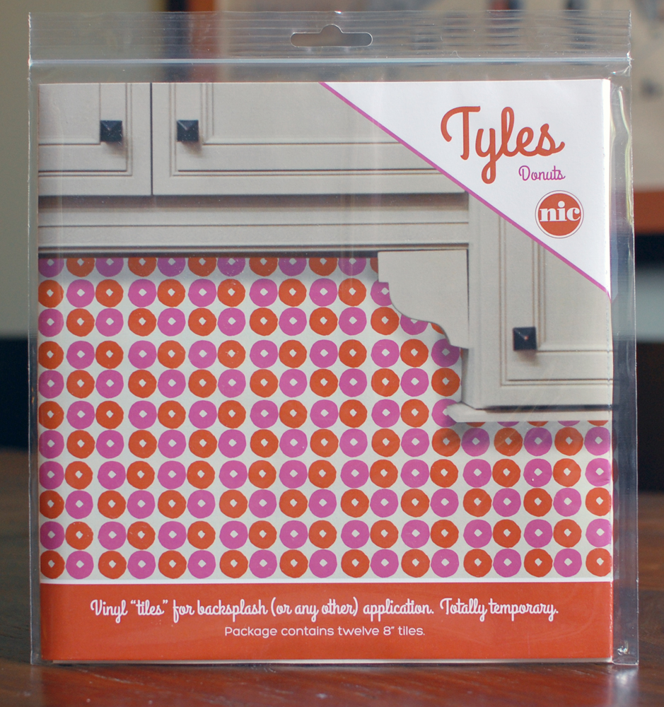
when i released the first 5 patterns for Tyles back in May, i did it in a big rush. the stationery show was coming up, and i wanted to make sure they were at the show and ready to go. so i found a look that worked for the imagery i had on hand, and did the best i could do.
and this, fellow designers, is a lesson in “it’s never too late to change your mind.” i knew that the look was wrong from the start. oh, it looked ok. but it also looked cute. i hate cute. cute is not my thing. i didn’t want Tyles to feel cheap, to feel like a side project. i mean, it’s a serious thing! it’s hot design! it’s a new way of changing your decor! i wanted it to feel MAJOR. and it didn’t. it felt nice. blech.
when in discussions with a new manufacturer on how Tyles needed to be changed in order to be put into production, i was thinking about where this product needed to fit in the market. it needs to live with high-end wallpaper. it needs to feel bold and edgy, but still retaining a certain amount of class. and, as is always important in logo design, it needed to reflect the brand.
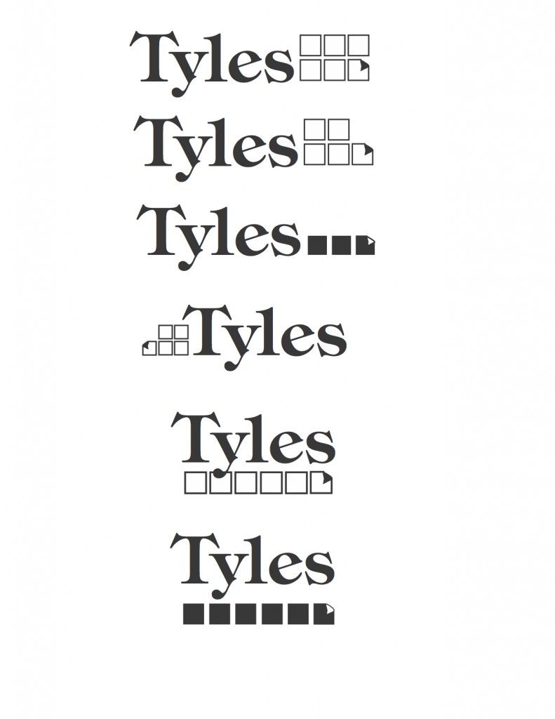
if i told you how many iterations i went through… from just type treatments to tiled icons that looked not-so-vaguely like a well-known computer brand, i agonized over this. there is NOTHING HARDER than branding yourself. NOTHING. as a designer, you torture yourself with your knowledge of how much it could possibly suck, and then manage to freeze your progress completely.
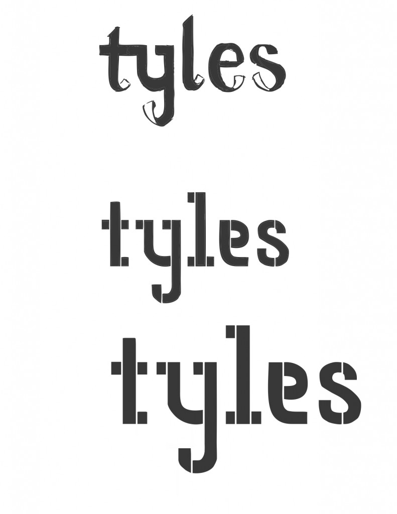
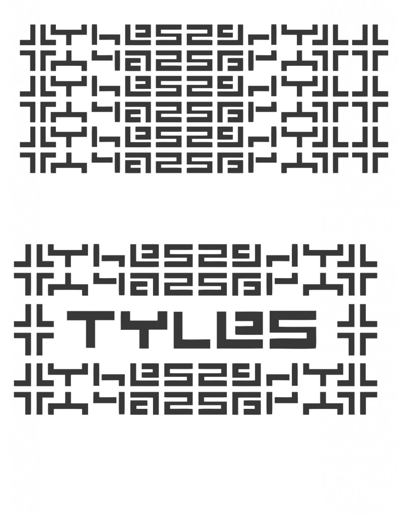
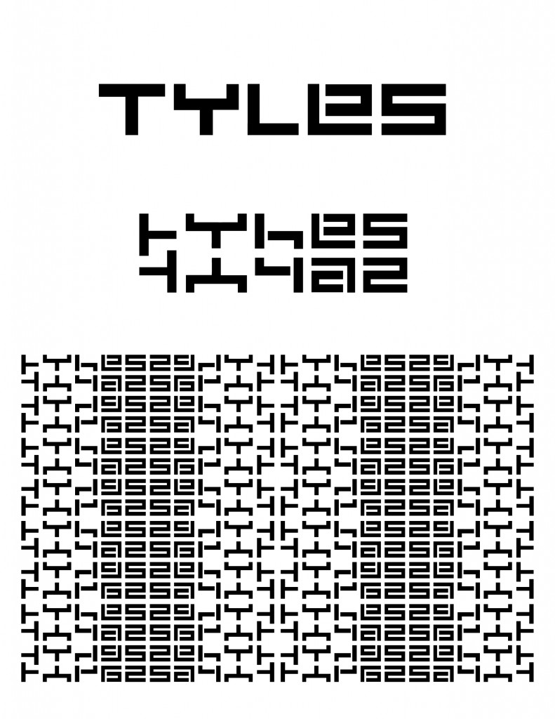
finally, i was getting somewhere. after all other options failed, i did what i did best — i made a reflective pattern out of the word “Tyles”. well, at least an abstracted version of the word. and it felt good. it felt a bit tribal, a bit classic, a bit greek key… and very much my brand and style.
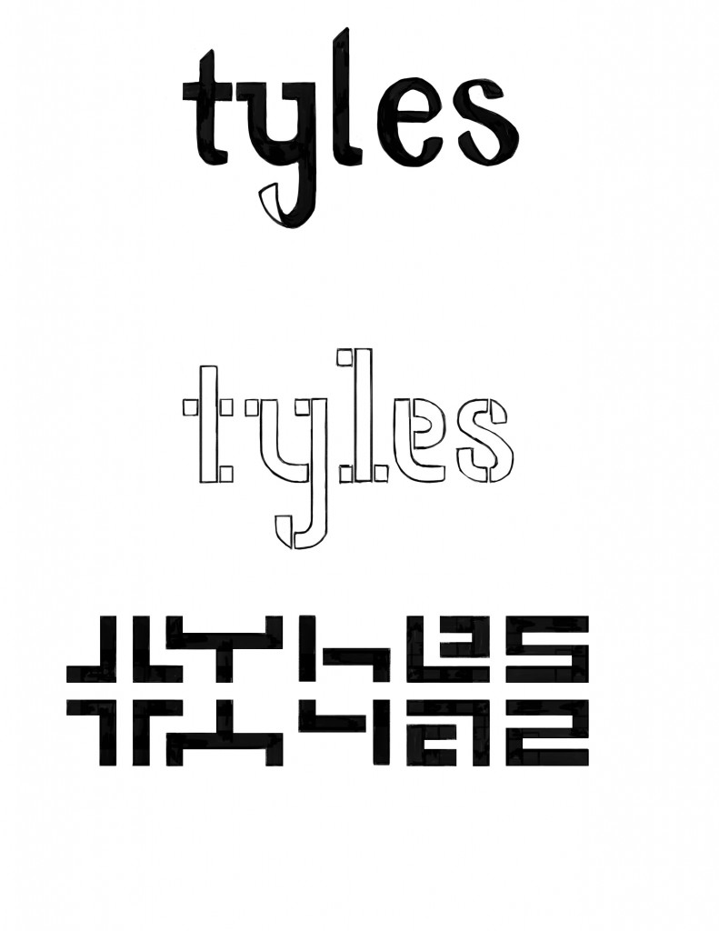
i brought the letters out of the pattern (a little backwards, i know) to arrive at my final logo. i also cleaned up and changed the patterning a bit. i continue to use the pattern on my branding — it’s a website backdrop, it’s featured on the back of my packaging, etc.
phew. so glad that’s done. ![]()